Monday 24 February 2014

final cover linked to research

#

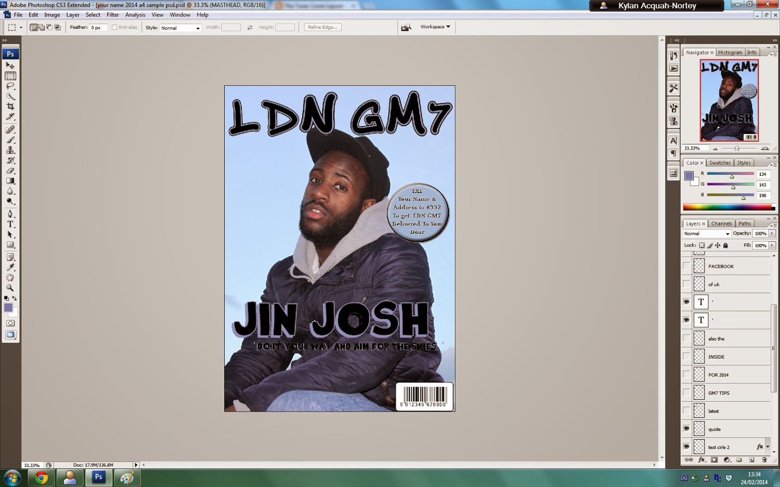
My final cover links to my research findings because it represents what my target audience liked and disliked.
 The colours that most attracted the audience were black, red and blue. I chose to go with blue, black and purple as I thought it worked better with my magazine. The shadow colour on the artists name is similar to the colour on his jacket. I wanted the colour scheme to link in with what my artist was wearing. I asked my target audience what most atttracted them to the front cover and the majority said the artist. On my magazine, I made sure I met those results as I have made the artist the biggest thing on the front cover. I have written little text to draw more attention to the artist. As the text and font was the second highest result from my research, I made sure to use a font that looked like graffiti to link in with theme of hip-hop. I made sure the text was in big, bold font so it stood out to the readers. The artist represents the hip-hop genre as he's wearing a hoodie and a snapback which are typically seen by male hip-hop artists.

Front cover finale


GIVE FEED BACK IN THE COMMENTS.

Cover layout front cover features

During the period while I was creating the magazine on the Photoshop I tried my best to stick with the flat plan but some changes were made due to the fact that it just worked better then what originally was planned.
A lot of differences just because it worked better and I was advised to change thing to make it more appealing to my target audience.


Cover layout - photo shop process

This is the image I have chosen to feature on my front cover so far. This is due to my fondness of the liking and the simplicity of the pose, which complements the  sky because of the jeans he is wearing also the sky being the limit it also has a metaphorical meaning as in my artist is trying to achieve and reach the limit to his music career. It also allows me to make any future changes to the image if needs be later on.


This is what i managed to create so far, i have managed to create and put a quote on to the front cover from the artist himself this is a will attract the target audience because they will want to know what us goin g on by the artist.


Concerns for the future: that the magazine may need to change the position of the bubble to fit in text before it to create more of a magazine effect.


Final Front cover


Cover layout rearranging

After I showed my teacher and spoke with her miss told me that I should change the font of 'Jin Josh' and also move writing about to enhance the effectiveness of it catching the readers eyes.

                                                                 
                                                        From this font to this one:

COVER lAYOUT- MastHead and font Decision

Didnt pick this font because it did not have a clean cut image to represent the genre type for my magazine.

Didnt pick this font as the mast head because it lacked the street mentality uk hip hop brings towards the game.

This  font was second place but it did not make it as the permanent mast head due to complications with other fonts. 

 This font is the winner and became the mast head i based my decision on the fact that it was edgy but still clean and instantly says to you rap uk rap way back from the garage days but it shows the development of the genre and it worked well on the front cover,

PHOTO MANIPULATION


Mis en scene

The mise-en-scene of the photo is everything to the clothing and the poses and position and camera shot represent the bigger picture of what it’s meant to represent and that is the snapbacks, hoods and coat jackets. Also the poses performed are a mise-en-scene of also representing the types of genres. My artist wore a blue coat, a greyish white hood and a white t shirt and this fits the mise-en scene because, of how the target audience associates artists from the genre. The look of rough but clean image is how it portrays its rightful genre.


Photo shoot process

Here are some of the images of the process of us taking photos and trying to get the right style for the artist and for my magazine. We tried different stuff in the process to see what would work what clothes and background in the photo.


SHOT TYPES/PROPS


TEST SHOTS

1. Close up of my main artist.         


 2. Medium shot of my artist.


 3.Medium shot in different clothes and different background.                                                                                                                                                                                                                                               
4. Tilted medium shot to try a different dynamics of the shot.                                                                                                                                                            


5 Low angle shot to grab the sky in the back to show some significance of my artist reaching the stars.                                                   
                                                              

           6.Low angle from a different position.

FLAT PLANS/ deconstructions